python
Python Data Visualization: Seaborn Barplot Examples
In this Python data visualization tutorial, you will learn how to create barplots in Python with Seaborn. Specifically, you will learn by many Seaborn barplot examples. If you are new to Python make sure to check the introduction to Python post.
Bar plots can be created in Python using the barplot() method from the Seaborn package.
Are you not sure if you have Seaborn on your computer? Learn how to list all installed Python packages.
7 Seaborn Barplot Examples
Now, in this section you will learn how to create bargraphs using Seaborn. In previous post, you have learned how to import data from CSV files in Python, and how to get user input in Python, among other useful things. Before visualizing your data, you might want to carry out data manipulation (e.g., removing variables, cleaning missing values etc.).
Seaborn Barplot Example 1: Basic Graph in Python
In the first Seaborn barplot example, you will learn how to create a basic barplot with Seaborn’s barplot() method in Python. First, you can create some values in two lists; x and y. In the example below, we assume that the values in the y-list are means and the values in the x-list is a grouping factor (e.g., gender).
#!/usr/bin/python3

import seaborn as sns
import matplotlib.pyplot as plt

x = ['Male', 'Female']
y = [1.2, 1.9]

sns.barplot(x, y)
plt.show()
Example 2: Changing the Color of the Barplot
In this Seaborn barplot example, you will learn how to change the color of the bargraph by using the argument “color”. It’s still a basic barplot, but it’s going to be blue in this example:
#!/usr/bin/python3

import seaborn as sns
import matplotlib.pyplot as plt

x = ['Male', 'Female']
y = [1.2, 1.9]

sns.barplot(x, y, color='blue')
plt.show()
Seaborn Horizontal Bargraph Example 3
Now, it is also possible to have the categorical variable on the y-axis and, thus, get a horizontal barplot. In the next Seaborn barplot example, you will learn exactly how to do that. Notice, how you just change the order of the x and y:
#!/usr/bin/python3

import seaborn as sns
import matplotlib.pyplot as plt

x = ['Male', 'Female']
y = [1.2, 1.9]

sns.barplot(x, y)
plt.show()
Now, most of the time you will not have your data in two Python lists, like in the first Seaborn barplot example. Typically, you will have the data stored in some format (e.g., CSV, Excel). In the next section, you will learn how to read a Excel (xlsx) file and plot the data.
Seaborn Barplot Example 4: From Excel Data
In this section, you will learn how to use Pandas read_excel to load data and then plot a simple bargraph with Seaborn. Specifically, you will learn how to load this dataset and plot the expertise level (1-3) on the x-axis and the “liking” ratings on the y-axis. First, however, you will need to load the data:
from pandas import read_excel

df = read_excel('wine_data.xlsx')
df.head()
sns.barplot('expertise', 'w1 liking (1-9)', data=df)
plt.show()
Seaborn Barplot Example 5: Grouped Graph
In this Seaborn barplot example, you are going to learn how to create a barplot in Python with Seaborn and group it by a categorical variable (e.g., gender). This is done using the “hue” argument of the barplot() method:
sns.barplot('expertise', 'w1 liking (1-9)',
    hue='Gender', data=df)
plt.show()
Example 6: Choosing the Palette for the Seaborn Barplot
In the next of the Seaborn barplot examples, you will learn how to set the palette of the plot. To accomplish this you just add the “palette” argument:
sns.barplot('expertise', 'w1 liking (1-9)',
    hue='Gender', palette='Set2', data=df)
plt.show()
There are many palettes (see the link above) to work with and you can create quite beautiful bargraphs this way.
Seaborn Barplot Example 7: Multiple Plots using Facets
In the final Seaborn barplot example, you will learn how to create multiple barplots. This is accomplished using another method from the Seaborn library. Namely, the catplot method. When using catplot() you can create other plots (e.g. swarm) as well.
sns.catplot('expertise', 'w1 liking (1-9)',
    hue='Gender', col='age', kind='bar', data=df )
plt.show()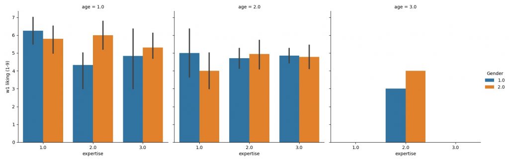
If you need to add a column to a Pandas dataframe, I refer to that post.
Conclusion: Python Seaborn Barplot Examples
In this post, you have learned by a couple of Seaborn barplot examples, how to create bargraphs in Python. Specifically, you have learned how to create bargraphs using lists and Pandas dataframes.